Charts and Graphs - Bovis Lend Lease Salary Data
Description:
Based on the information provided, we have created Tables, Charts and Graphs to understand promotion and salary trends at Bovis Lend Lease.
The Data:
This spreadsheet shows the Level (or position), Graduation Date, Salary, and School of study for 20 Employees in the operations department of Bovis Lend Lease. The second table provides information regarding the Level - Position column in the first spreadsheet.
|
Emp. # |
Level - Position |
Grad. Yr |
Salary |
School |
|
1 |
2-APM |
1997 |
51000 |
Florida |
|
2 |
1-PE |
2000 |
38000 |
Auburn |
|
3 |
5-OM |
1972 |
91000 |
Purdue |
|
4 |
4-SPM |
1991 |
78000 |
Vanderbilt |
|
5 |
3-PM |
1986 |
81000 |
Clemson |
|
6 |
6-PIC |
1981 |
150000 |
Florida |
|
7 |
3-PM |
1993 |
72000 |
Cincinnati |
|
8 |
1-PE |
2001 |
43000 |
Purdue |
|
9 |
4-SPM |
1977 |
68000 |
Florida |
|
10 |
3-PM |
1983 |
85000 |
Auburn |
|
11 |
3-PM |
1978 |
79000 |
Auburn |
|
12 |
4-SPM |
1988 |
87000 |
Stanford |
|
13 |
2-APM |
1995 |
48000 |
Ga Tech |
|
14 |
3-PM |
1992 |
59000 |
Georgia |
|
15 |
4-SPM |
1989 |
67000 |
Ga Tech |
|
16 |
2-APM |
1998 |
53000 |
Florida |
|
17 |
3-PM |
1990 |
71000 |
Ga Southern |
|
18 |
5-OM |
1980 |
115000 |
Alabama |
|
19 |
3-PM |
1996 |
60000 |
Auburn |
|
20 |
5-OM |
1970 |
140000 |
Ga Tech |
Level Init. Position Title
|
1 |
PE |
Project Engineer |
|
2 |
APM |
Assistant Project Manager |
|
3 |
PM |
Project Manager |
|
4 |
SPM |
Senior Project Manager |
|
5 |
OM |
Operations Manager |
|
6 |
PIC |
Principal In Charge |
Variables:
The variables in the above Spreadsheet are Position, Year of Graduation, Salary, and the School from which one received their degree.
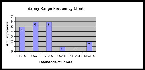
Frequency Table:
The following data table indicates the number of employees making a salary that falls between the given "bins", or salary ranges. This table tells us that the majority of employees in this department make less than 100k.
|
Frequency |
Range ($k) |
|
0 |
<35 |
|
5 |
35-55 |
|
6 |
55-75 |
|
6 |
75-95 |
|
1 |
95-115 |
|
0 |
115-135 |
|
2 |
135-155 |
|
0 |
>155 |
Bar/Column Charts:
This Column Chart is a graphical illustration of the Frequency table just reviewed. This graph, as with most data given with illustration, shows more clearly, that the vast majority of employees make between $35,000 and $95,000.
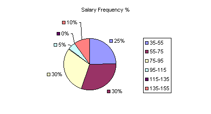
Pie Chart:
By percentages, this pie chart shows what percentage of the observations fall within which salary ranges (thousands of dollars), or bins, in the Frequency Table. Again, we show the same data, but with percentages. 85% of operations employees make less than $95,000.
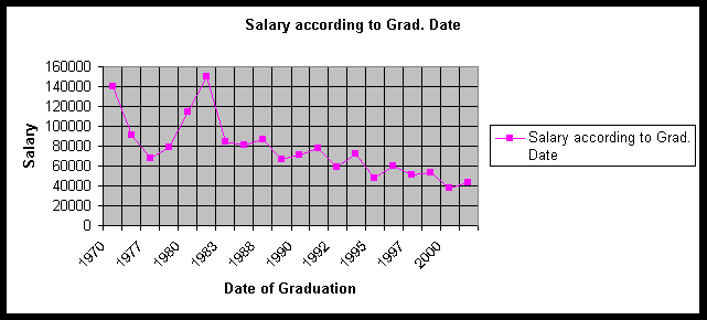
Line Chart:
This chart shows the growth of salary over time since graduation. There appears to be a significant relationship between the date of graduation and a person's annual salary.
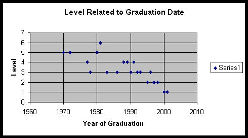
Scatter Plot:
This scatter plot was created to determine if there is a correlation between an employee's level (position) within the company and the date of their graduation. This scatter plot indicates that a person's level within the department correlates with an employee's date of graduation.
Conclusion:
Based on the graphs, tables and charts created, it can be statistically argued that a person's salary and level/position has much to do with the date that they graduated from college.